Friday, March 22, 2019

Evolution of a painting


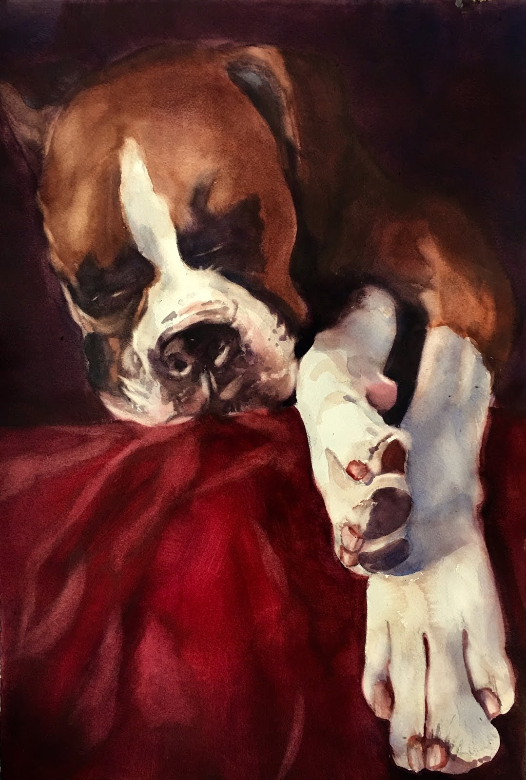
See how the mood of this painting changes with each stage?  I was tempted to leave Grover hanging out in space on the white paper.  The image itself was intriguing enough, who needs a background?  But when I decided to wrap him in darkness- that made it seem he was emerging from a dark, quiet room.  Adding the red blanket just seemed a good complement to his fur.

 
Grover, watercolor on Arches cold press 140lb. Paper
15x22
To add drama to your work, consider your color palette.  Use rich hues and velvet darks, and don’t forget to save the white of your paper strategically.  Consider your composition.  Where do you want your viewer to look first?  Your focal point will be where the lightest light and the darkest dark meet.  Finally, is there a way to add emotion to your subject by the way you position it on the paper?  Remember, there are no boring subjects, just boring paintings.  Liven yours up with well thought out composition.


Thursday, June 9, 2016

Lucky Dog Pet Portraits

Our Trade Show booth-Seattle Amazing Pet Expo

    What a great weekend!  I'm happy, tired, and relieved that it's over.  I loved meeting all the people and seeing their pets.  But what stayed with me was the stories of adoption, rescue and compassion.  One woman wore a shirt that said "who rescued who?"  The owner of this little guy was telling me of all the medical milestones she and her dog had to reach together.  His back is damaged which resulted in his hind legs becoming completely useless.  She has no regrets paying for all the medical care he has needed,  because when he looks at her with those big brown eyes- she sees the love there.  I'm hoping for a steady stream of pet portraits because of the joy they bring to me while I paint them, and to the owners who love their pets so tenaciously.  Their kindness is so refreshing.

Friday, April 15, 2016

Paint or plant?


     Three White Roses- 13x22 watercolor on Arches paper, $575.00

   I am a frustrated gardener.  My yard is in a woodland setting and much too shady to grow these beauties.  Not to mention my assistant gardener- our dog Mocha.  If she becomes too suspicious about something newly planted in the backyard, she rips it right out of the ground with her teeth.  Since my camellia suffered this fate recently, I have been reluctant to plant anything as regal as a white rose.  Painting them my be the first stop in my gardening therapy.
   I knew I would be painting roses for the floral show May 6, at the Inn at the 5th.  You can't have a floral show without the queen!  Even though these are white, there are still colors on their petals that depict light and shadows.  Warm light trapped in the folds intensifies and glows a peachy gold.  I chose purple and blue shadows as a good compliment color.  The dark background is saved for last and has to be thickly applied- usually in several steps.  It's a secret sauce, created by my watercolor teacher, and it can be mixed using Pereleen Maroon, Ultra Marine Blue and a little Mineral Violet.  And poof! Instant roses!  
   These roses and more can be seen May 6 at the Inn at the 5th.


Sunday, April 10, 2016

Painting to Bloom!

BloggerImageHydrangea- 22x30 watercolor on Arches 140lb Paper.  $2,500
 
   Im having a lot of fun painting florals for this upcoming show at the Inn at the 5th.  They have a celebration called Bloom every year and this year, my art will be featured at the First Friday Art Walk, 
May 6, 5:30-8:00.
   I have been fiddling with photo shoots of flowers for this series because I wanted a floral noir kind of look- mysterious dark background with deep shadows to play off the creamy whites of the flowers.  This hydrangea was so much fun because it captured some of the light inside the blossom, giving that warm glow.  In an attempt to capture that look with colors , I kept all the petals on the outside of the flower in cool blues and lavenders while every thing inside the petals is warm oranges and greens and greys.  I added colors to my palette for this project,  cobalt blue and mineral violet are the old standbys, but I added Verditer blue from Daniel Smith.  For the warm tones I used Gamboge Yellow and Azo yellow but added a yummy orange called Scarlet Pyrrol, and Cad Red Scarlett along with some Rose Madder Genuine.  
   Your colors become your friends.  You become familiar with the way they perform together.  Adding new ones can be risky.  How do you know they will "play nice" with your old friends and give you the effects you want?  I kept a strip of paper next to me and mixed the new colors with the old before I used them on my painting.  The test strip is a bit like training wheels- feels annoying and slows you down.  But disciplining yourself to throttle down and use it gives you your predictability back.  That way you dont have any ugly surprises on your painting.  I have a lot of bad color mixing stories that you dont have time for!  After having to literally scrub color off your painting in the sink, you become more careful the next time.  Lesson learned!

Monday, March 28, 2016

Surprised!

Every month I enter an online art contest called The Bold Brush Painting Contest.  I opened my email to find this notice that I won the Outstanding Watercolor award for February.  I'm honored they chose this painting I gave to my son for his office.  It is a sign up the McKenzie River that no longer works but has a lovely veil of rust due to our Oregon rain.  

Here are a few places my art will be featured locally:
April 1-  Pacific Rim Gallery, 160 E. Broadway, Eugene, OR.  First Friday Art Walk.  There will be several of my favorite florals and I will be painting a floral still life at the event.  5:30-8:30
April 9,10,11- Watercolor Society of Oregon Spring Conference, Silverton, OR  I have a painting hanging in this competition.  It's a double portrait of two snorkelers that always makes me giggle.  They are celebrating their 45th wedding anniversary, so it's entitled How Deep is Your Love.   I will let you know if I win any prizes.
May 6-  The Inn at the 5th, 5th St.  Eugene, Oregon. First Friday Art Walk.  Every year the 5th Street Public Market has a celebration called Bloom.  They will be featuring my watercolor paintings of white peonies, roses and light blue hydrangeas in a show called Flowers Noir.  Each subject is spotlighted to create dramatic shadows and softly glowing highlights.


Peonies, 22x30. Watercolor on Arches paper, $ 2,500.

Monday, January 25, 2016

Finish Well

        
           Dragon Dance 15x22  


Definition of insanity- Doing the same thing over and over yet expecting a different result.  

   Why would I start this painting over again after just finishing the first version?   Simple- I changed my mind about a few things.  Isn't that a girls perogative?
    First, I decided it was an image of such complex rendering, concentrated color and unique subject matter that it deserved to be bigger.  
    Second, I became intrigued with the notion that the watercolor could create more interesting smoke than I did.  I loved this element in the first painting but I thought of it too late and it was created over the top of other painting in the background painting.  While you can't see anything amiss in the smoke, it isn't as organically watercolory ( is that a word?!?!?) as in the second painting.  It may not seem as impactful of a change in the photos unless you zoom in or see them in person.  Yummy color fusion!
    Third, I wanted to take more time and have larger shapes so I could concentrate on creating a beautiful finish.  Finishing well is a worthy goal in life as well as in painting.  As I am connecting all the lines, smoothing out fields of color, eliminating unwanted brush strokes and properly forming the shapes of objects, I am trying to make the painting look resolved.  
   I can't help but be reminded as I'm working that this is also my goal in my life.  To live my faith in a loving God in a way that my kids and grandkids can someday say, " If that is what a Christian looks like then I want to be one too."  Can I be that kind, that loving, that determined to do what's right, especially when it's not convenient or fun?  I doubt it, not without His help and a little more humility on my part. Maybe doing something over again is the only way to get it truly right. Connecting the lines and removing the blemishes- who knew that art and life could sometimes overlap?
   Come see my show called, East West Fusion, where this painting as well as some others painted from photos I took while visiting China will be featured and on sale.  First Friday Art Walk, February 5, at the Pacific Rim Gallerry, 160 E. Broadway. 

Friday, December 11, 2015

Snow in the Forecast

.
New York Snow- watercolor 22x30. $1,675.00
Pacific Rim Gallery 160 E. Broadway, Eugene, Oregon

   As soon as the weather starts to turn, I go on snow watch.  When I was a child, I loved the snow days.  My father would come to school and check us out early with some lame excuse and we would go sledding.  One of the benefits of living on a hill is that I don't drive in it.  That means that even a skiff of snow creates a full on snow day at my house- complete with snow men in the yard and movies on tv.  
  My fascination with urban subject matter is a great chance to make it snow.  This painting was created from images from another season and I adapted it to reflect my snowy fantasy.  If you look closely you will even find Christmas trees and holiday lights, which were not in the reference photos.  The glow of the headlights on the wet street was created by allowing yellow and orange pigment to run down through the dark ultra marine blue/ perylene maroon mixture that is the pavement.  Melting snow is piled in the gutters as the next flurries start to fly.  All the architure and perspective is the same and provides a real challenge for any artist to create that feeling of walking down this street surrounded by these beautiful old high rise buildings.  An art assignment worthy of any season.
   If you live in Eugene, you can see this painting- currently on display at Pacific Rim Gallery, 160 E. Broadway.  Open Fridays and Saturdays, 12-5. 

Monday, November 30, 2015

Paintings on my mind

Dragon Dance 15x22 watercolor on Arches paper $875.00
  
What do you think about in that moment before you pass from the waking world into sleep?  If you,re like me, you have a painting in your mind.  I see the photo in my imagination.  I'm working out composition, palette, what to leave out of the photo as I drift off to sleep.  For years I have carried this image in my phone of this girl in a parade in Oahu.  I snapped it because I was intrigued with the dragons head.  It is a beautiful piece of art in its own right.  After taking the picture I saw the image of the girl holding it up.
  I made many changes to the photo, leaving out a lot of colors and shapes behind her torso.  I also removed two other people standing near her.  I also extended the ribbons so they would drift across her body.  Last, I pumped up that powerful red color.
   Why did I wait years to paint this?  I had lots of themed shows I was composing and I knew I wanted to wait till I could work only on this painting.  Dreaming about it for so long allowed me to be very sure about the approach I took.  Taking extra time to plan also gives your skills time to develop.  Some images you desperately want to paint feel just technically out of your grasp.  Waiting lets you grow into the painting you have been dreaming of.  A little paper, a little colored water... The stuff dreams are made of.


Tuesday, October 6, 2015

First Friday Vistra Show

Joneile and the current reigning "Slug Queen" during First Friday Artwalk, Oct. 2, 2015

   Many thanks to my friends at Vistra Frame Gallery.  They hosted my current show called "Eugene in Color".  The show grew out of a desire to embrace the unique flavor that is downtown Eugene.  Diane and Pat took such  good care of me, bringing food and water to me as I painted an image of the iconic Fish Fountain in the park.  I met so many great people in the course  of the evening too.  Being the last stop on the tour was a fun way to end the night.  Our master of ceremonies was none other than the Slug queen.  If you are in the Eugene area, come see all the images in the show.
   
Taken for a Ride 15x22 Arches paper $750.00

Kesey Square (still in progress here but finished and hanging in Vistra Gallery).  22x30 Watercolor, $1650.00
   To purchase these works or see more, go to Vistra Frame and Art Gallery, 160 E. Broadway Eugene, Oregon.  Open 10:30-5:30 weekdays. 541-343-2353

Saturday, August 29, 2015

Back to Blog


Taken for a Ride,  watercolor on Arches paper,  $ 750.00

They say you can never forget how to ride a bicycle.  If you haven't been riding for a while, you can just get back on and you won't miss a beat.  I'm hoping that also applies to blogging.  Maybe you have noticed that I haven't posted a new blog for almost a year.  I don't know why I quit writing about my art process- I just quit taking the time to put into words the inner struggle that produces my watercolors.
I've missed this, though and as I'm writing this I realize that including other people in this creative endeavor is important.  We all want people observing our lives so we can share experiences and compare notes!
There have been at least two major events this year that have impacted my art.  
I moved my studio to another room in my house.  That sounds so simple but it was an incredible journey.  For the month that I was actively moving, I could be seen at odd hours of the day or night, with a glazed look in my eyes, wandering the halls with random piles of art materials in my hands.  Muttering unintelligibly to myself, looking for storage!!!  My new studio is smaller but much better organized.  
The other big event was an opportunity to be involved in restoring 100 year old stencilling and murals out of state.  I lived at the job site for 5 weeks and I felt so honored to be able to help preserve such a beautiful piece of history.  Because the client requires tight security, I could not post pictures of the work I did or take any photos of the inside of the building.  I hope to do more work like this in the future.
I think there is a connection between riding a bike and blogging- I'm so happy to be blogging again and I feel an uncontrollable urge to put on a helmet.  What does that mean?

See this painting and more in the series, Eugene in Color, at Vistra Framing Gallery at 160 E. Broadway, Eugene, Oregon.  First Friday Artwalk,  October 2,  5:30-8:30

Thursday, October 23, 2014

3 Steps to take your paintings to the next level.

Seattle in the Morning, 22x30  $1650.00

This painting has been a threshold for me.  I have set some new goals for my work and I can see in this painting an attempt to stretch beyond what I have achieved so far.  The subject matter is new for me.  I'm trying to put together a collection of paintings for an upcoming show at the Inn at the 5th depicting Urban Street scenes.  The people are intriguing to me, they create such interesting shapes and the varied colors in their clothing create a confetti look.  This is especially pleasing against the large dark shape of the newsstand/coffee shop.  The design challenge was to create enough color and subtle structure inside that dark shape to allow it to "play nice" with the other elements in the composition and not become too dominant.  The buildings on the left will get more attention from me as I turn towards finishing this piece. 
Tips to take your art to the next level-
1.  Try new subject matter.  It requires fresh imagination and new techniques.
2.  Study with someone who's work you admire.  The learning process is filled with discovery and requires new disciplines.  Look for a regular teacher or take a workshop.
3.  Find a critique group.  Matisse said, "Creativity takes courage."  Join with artists who you trust both their professional opinions and their motives.  A healthy critique group can help you see hindrances to your work as well as celebrate a win with you.

Monday, October 20, 2014

Congrats!

Lavonne Tarbox Crone wins Best of Show at Watercolor Society of Oregon Conference.

  My favorite moment of conference was when we came to the gallery and found that Lavonne won this award.  She consistently  enters beautifully designed and executed paintings.  At the awards ceremony she received a standing ovation.  Yay Lavonne!!!

  
Joneile gets an Award of Distinction at Watercolor Society of Oregon.

   My second favorite moment was finding that I won an award as well!  It was such a great conference .  Linda Daley Baker was the Juror.  She was very strong on critique and gave us lots of great design information.  How great to be a part of this group.

Friday, September 26, 2014

The Great Pumpkin

Harvest- 15 x 22 Watercolor. $675.00

The weather is turning, the leaves are falling in my ponds, it's coming on to Fall.  I can hear the Peanuts music from The Great Pumpkin playing as I paint.
This still life was a blast to paint!  The creamy white highlights on the Turbin Squash play against the vibrant oranges and golds so traditional of the season.  The real drama is created by the super warm dark holes in the negative space around the produce.  Not truly black, this color is created by combining Perylene Maroon, Ultramarine Blue and a tiny amount of Mineral Violet.  What a lovely concoction!  Red creates depth in a painting and a few "hot holes" can make it seem as though you can reach right in there!  
To see this painting on display, come to the Pacific Rim Art Gallery, 160 E. Broadway, Eugene, Oregon. 
The show "Fall In Love With Oregon"will be featured at the First Friday Art Walk, October 3, from 5:30-8:00. See you there!

Friday, September 12, 2014

Not Enough Neon


Ivory Court Motel- Blue River, Oregon

You would think by now I would be pretty tired of neon.  The truth is- I don't think I will ever get tired of trying to recreate this advertising art form in watercolor.  I was driving down the Mc Kenzie River Highway, minding my own business, when I saw this sign in all it's rusty glory.  I stopped the car and began taking a reckless number of pictures right there on the side of the road.

Back in my studio I changed the sky from a bright blue to this overcast one.  After all, it's Oregon!
The biggest change was that I moved the top of the sign to the right so it's directly over the "M" in "motel".  This allowed me to make all the letters much bigger.  The power lines were made using watercolor pencils and a straight edge, and also a brush and paint for the wider lines.  Note how they fade out as they get to the bottom of the painting and finally retreat out of sight.  This creates an illusion of distance and perspective.

Friday, August 15, 2014

Boondoggling through a Painting

Are we there yet?
   How many times have you heard your kids ask that question?  Road trips and art-  they both provide the perfect opportunity to display impatience.  We have followed this image through three stages of its evolution from photograph to painting.  That's my current goal, to begin to see photographs as information for possible paintings, not paintings themselves.   I carry hundreds of images on my phone that I took because something caught my eye.  Was it the composition, the light, or the subject itself?  The danger ( and my oft repeated mistake) is to just reproduce the photo.  I jumped into painting this street scene without asking myself some critical questions about composition.  Our brains will accept and try to make sense of bad information in a photo, but not in a painting.  The branches of foreground trees looked like snakes in the painting, the street light coming from the left cut the painting in half, the street in the foreground was weak and didn't provide the depth of color to "ground" all those tall buildings.  Making all those changes has vastly improved this painting but it took twice as long as if I had recognized these compositional issues in the first place.
  I feel like I should know these things by now.  And I know my teacher is constantly amazed at how many ways I avoid immediate success.  Why must I always take the longest road possible to finally arrive at my destination?  Because boondoggling, or wandering around mindlessly, is characteristic of me in general.  I go to the store to get a gallon of milk and come back 45 minutes later with three bags of groceries and an old chair I bought at the second garage sale I stopped at!  
  The moral of this very long story?
 1.    Using the same brain you use in your every day life can be hazardous to your art!  
 2.    The shortest road to success in any painting is to follow the road map of good composition              before picking up a brush!

Sunday, July 20, 2014

Who am I, anyway?


 This has been a busy summer!  I've had lots of opportunities to share and show my art.  
Good, but keeps me out of my studio more than I like.  It's always a delicate balance between producing art and promoting it.
   I'm finally beginning a new series of paintings that will depict urban street scenes.  This is the first painting and as you can see it's not done.  How do you know if a painting is done?  A good friend told me if you can identify problems in a painting, and you know how to fix them, you are not done.  I'm pretty good at fixing problems by now cuz I've made lots of mistakes!  It's identifying them in the first place that's tricky.  You can stare at a painting you are working on for hours and simply miss what's wrong.  That's where belonging to a good critique group comes in.  After seeking good counsel, these are the problems I've identified.


  This painting had some branches that were distracting because of the angle they were hanging, so I removed them.  The dark values were too strong, I muted them. There was a street light beam that cut thru the middle of the painting from the left in the trees.  That had to go!  Now I'm down to some issues with the cars and how dense the traffic is, and the way the street looks like it's falling straight down from the cross walk.  This creates an unsettling precipice effect.  A little stronger color in the foreground might be the pop this painting needs as well.  Much left to do.
   How does this relate to my identity as an artist?  I've worked on such varied subject matter- portraits of people and animals, still lifes, florals, botanicals, neon signs, landscapes, and now buildings...will there ever emerge something that defines my work?  I don't have the answer to that.  My watercolor teacher says- in the full bloom of an illustrious art career- that she doesn't think anyone can truly know that.  She says she doesn't even know that herself.   Maybe we will just discover what we love to paint!  And maybe knowing that will set us free to indulge ourselves in just painting what we love.  What would galleries look like if they were filled only with artist's most passionate subjects?
    I was recently challenged with this question,  "What makes you different than all the artists you know?  What makes your work stand out?"  Then I am supposed to make a list of qualities that make me different.  I'm still working on that list but it's a question we all need to ask ourselves.  Then, once you know some of the answers to that, how are you showing that uniqueness to people who view your web or blog site.  Deep, huh?  And you thought all I had in my head was colors :-)

Sunday, June 29, 2014

4th of July at Pacific Rim


        Collaboration- July show at Pacific Rim Gallery
        Featuring Dan Chen, Sandi Grubbs and myself

All three of us painted this picture, taking turns to add our own touch.  It is amazing to see the three different styles blend into one painting.  Sandi does Chinese Brush, I do watercolor and Dan does a fusion of Chinese inks, watercolor, metallic powder and pastel that is truly dazzling.  There are three canvases like this, a triptych with one painting done by each of us individually but designed to be hung together, and one painting done by each one of us on our own.
Preparing for this show has been a rich experience for me.  Artists spend so much time alone.  It's refreshing to be with people who want to share their experience, their habits and disciplines -their lives. Thank you Sandi and Dan for the joy of creating together.

 If you are in the Eugene area and want to see the show, come to Pacific Rim Art Gallery,  on July 4th, 160 E. Broadway (in the basement of the old Quackenbush building.) The Art Walk begins at 5:30 and we are the next to the last stop.

Friday, May 30, 2014

Bloom- Inn at the 5th


A new gallery wall at the beautiful Inn at the 5th in Eugene is currently featuring my floral paintings!  
After the show at the Jacobs Gallery I was invited to display my work in this lovely space.  

This was originally a 20 piece show that helped kick off the annual Bloom celebration at the 5th Street Public Market.  Many of these paintings were done and ready for framing, but I had less than two weeks to pull this show together.  In the end I painted six new works and matted and framed sixteen paintings myself!  Needless to say I worked through the night many times that week.  Seeing all those paintings framed and hanging on the wall gave me a real sense of relief.  Hard work is necessary even in art, and I felt like this opportunity was a test to see if I would step up to the challenge of creating a show in this short time frame.  Thanks to Vistra framing gallery and my friend, Sandi who helped me hang all this work, it's up!

If you want to see this show, and you live in Eugene, go to the Inn at the 5th and ask at the front desk if they will open the Maple Room so you can see the art.  Their staff is some of the most gracious people I have worked with and they will walk you back there.


Thursday, March 27, 2014

Rhythm- Jacobs Gallery show opens


This was such an amazing night.  The show was so beautifully done by Beverly Soasy, who is the gallery director.   The other two artists featured had really fabulous work on display and spoke so eloquently about what inspires their art.  Many friends and family came to congratulate me, including my watercolor teacher, Lavonne Tarbox Crone.  Without her none of this work would exist.  Everyone applauded when I introduced her.  She has truly enriched my life and I will be forever thankful to her.  Thanks to all of you who have encouraged me along the way.  I feel so blessed.
This show will be up till May 3.  Another reception will be held on the First Friday of April where we will be a stop on the Art Walk.  The gallery will be open 5:00-8:00 that evening.  Regular Jacobs Gallery hours: Tues- Friday 12-4,  Saturday 11-3

Monday, March 17, 2014

Out of My Hands


The neons have been delivered!  Finally, I took these paintings that I have worked on for almost two years and delivered them to the Jacobs Gallery.  The show is called Rhythm, and will feature my neon sign paintings in watercolor, as well as beautiful stone sculptures and some very impressive prints.  I'm really looking forward to seeing them all hanging in the gallery, framed and matted!   The show opens this Friday evening at 5:30.

 
There is more than one way to slay a dragon!  
The bottom picture is the original image.  When it was almost finished, I took it to be critiqued and we all felt the background was too strong in color.  After stripping out the intensity, the blue looks fresher, as though the dragon can finally breathe free.  Note the changes in the fire at the head of the dragon.  It is much clearer and we have strengthened the lines as well by changing some of the values.  Taking the bold chance of making such big changes so late in the painting is not for the faint of heart.  Yes you will solve the obvious problem, but what others will this change create?  I had decided that if I hated it I could always start over.  In the end, I was happy and called it DONE.